1971 Topps Baseball Card Checklist – Vintage Review –
1971 Topps Baseball Card Checklist
’71 Topps Baseball is known for its distinct black borders that easily got damaged over the years. Finding a complete set in ‘NrMt-Mint’ condition might be close to impossible – which is not always the case for other sets released in the era. As we will later discuss, centering issues along with the black card-stock make this a very tough set to complete in solid condition.

The rather ‘lazy’ design of just a black border + Team + Name + Position might be due to the fact that according to this blog Topps might have spent more time on other aspects of the card.
“Even as old as the cards looked, and still look nearly 40 years later, Topps had some surprises in 1971 beyond the black borders, which were actually fresh: (1) this the first time Topps put a player’s portrait on the reverse of the card; and (2) this was the first time Topps used action pictures for regular issue cards, as opposed to reserving action photography to World Series, playoff and “special” cards.”
Another interesting note that younger collectors might not know is that you could order sets directly from Topps even in the 1970’s. Within the comments section of the blog quoted above, here is one collectors recount of buying the sets via mail:
“The ’71’s were the first set I ordered directly from Topp’s. They were $12.50 if memory serves. I ordered complete sets later which came all at once, but the ’71’s were delivered in series – it took all summer to get them all. I was in Little League at the time and it wasn’t unusual for BB cards to be carried in one’s back pocket – a definite mistake with this series. If you did ANYTHING to these cards the black border was damaged and they looked terrible. I remember not even wanting to touch mine because they were so perfect. Still have them.”
eBay Seller: WholeLottaLumps – wrote this eBay review
on the set – and it is worth checking out if you are interested in completing this set. The seller brings up some interesting points about centering – according to him, its very difficult to find some cards with 50/50 centering.


“Anyone who has attempted to put together a nice ’71 set knows about #536 Claude Raymond. A Claude Raymond that is centered literally does not exist. Nor does one that is slightly off center. If you are looking for a nice clean set and off centered cards bother you, ’71 Topps will drive you to drink.”
“Jim Lonborg #577. After Claude Raymond, this is (in my experience) the most difficult card to find centered.” Source: WholeLottaLumps
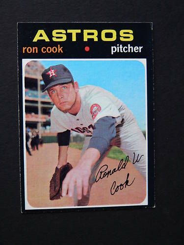

“A cool variation I discovered is #583 Ron Cook. Most cards show his eyes rolled upward but there are tougher examples of Ron looking directly at you. Same thing with #133 Mickey Lolich. Eyes to the sky and eyes directly at the camera.”
Source: WholeLottaLumps
Complete 1971 Topps Baseball Set Checklist
– Find The Top Cards on eBay Below –
#1 Baltimore Orioles TC
#2 Dock Ellis
#3 Dick McAuliffe
#4 Vic Davalillo
#5 Thurman Munson
#6 Ed Spiezio
#7 Jim Holt RC
#8 Mike McQueen
#9 George Scott
#10 Claude Osteen
#11 Elliott Maddox RC
#12 Johnny Callison
#13 Charlie Brinkman RC – Dick Moloney RC
#14 Dave Concepcion RC
#15 Andy Messersmith
#16 Ken Singleton RC
#17 Billy Sorrell
#18 Norm Miller
#19 Skip Pitlock RC
#20 Reggie Jackson
#21 Dan McGinn
#22 Phil Roof
#23 Oscar Gamble
#24 Rich Hand RC
#25 Cito Gaston
#26 Bert Blyleven RC
#27 Fred Cambria RC – Gene Clines RC
#28 Ron Klimkowski
#29 Don Buford
#30 Phil Niekro
#31 Eddie Kasko MG
#32 Jerry DaVanon
#33 Del Unser
#34 Sandy Vance RC
#35 Lou Piniella
#36 Dean Chance
#37 Rich McKinney RC
#38 Jim Colborn RC
#39 Lerrin LaGrow RC – Gene Lamont RC
#40 Lee May
#41 Rick Austin RC
#42 Boots Day
#43 Steve Kealey
#44 Johnny Edwards
#45 Jim Hunter
#46 Dave Campbell
#47 Johnny Jeter
#48 Dave Baldwin
#49 Don Money
#50 Willie McCovey
#51 Steve Kline RC
#52 Oscar Brown RC – Earl Williams RC
#53 Paul Blair
#54 Checklist 1
#55 Steve Carlton
#56 Duane Josephson
#57 Von Joshua RC
#58 Bill Lee
#59 Gene Mauch MG
#60 Dick Bosman
#61 AL Batting Leaders – Alex Johnson – Carl Yastrzemski – Tony Oliva
#62 NL Batting Leaders – Rico Carty – Joe Torre – Manny Sanguillen
#63 AL RBI Leaders – Frank Howard – Tony Conigliaro – Boog Powell
#64 NL RBI Leaders – Johnny Bench – Tony Perez – Billy Williams
#65 AL Home Run Leaders – Frank Howard – Harmon Killebrew – Carl Yastrzemski
#66 NL Home Run Leaders – Johnny Bench – Billy Williams – Tony Perez
#67 AL ERA Leaders – Diego Segui – Jim Palmer – Clyde Wright
#68 NL ERA Leaders – Tom Seaver – Wayne Simpson – Luke Walker
#69 AL Pitching Leaders – Mike Cuellar – Dave McNally – Jim Perry
#70 NL Pitching Leaders – Bob Gibson – Gaylord Perry – Fergie Jenkins
#71 AL Strikeout Leaders – Sam McDowell – Mickey Lolich – Bob Johnson
#72 NL Strikeout Leaders – Tom Seaver – Bob Gibson – Fergie Jenkins
#73 George Brunet
#74 Pete Hamm RC – Jim Nettles RC
#75 Gary Nolan
#76 Ted Savage
#77 Mike Compton RC
#78 Jim Spencer
#79 Wade Blasingame
#80 Bill Melton
#81 Felix Millan
#82 Casey Cox
#83 Tim Foli RC – Randy Bobb
#84 Marcel Lachemann RC
#85 Billy Grabarkewitz
#86 Mike Kilkenny
#87 Jack Heidemann RC
#88 Hal King
#89 Ken Brett
#90 Joe Pepitone
#91 Bob Lemon MG
#92 Fred Wenz
#93 Norm McRae – Denny Riddleberger
#94 Don Hahn RC
#95 Luis Tiant
#96 Joe Hague
#97 Floyd Wicker
#98 Joe Decker RC
#99 Mark Belanger
#100 Pete Rose
#101 Les Cain
#102 Ken Forsch RC – Larry Howard RC
#103 Rich Severson RC
#104 Dan Frisella
#105 Tony Conigliaro
#106 Tom Dukes
#107 Roy Foster RC
#108 John Cumberland
#109 Steve Hovley
#110 Bill Mazeroski
#111 Loyd Colson RC – Bobby Mitchell RC
#112 Manny Mota
#113 Jerry Crider
#114 Billy Conigliaro
#115 Donn Clendenon
#116 Ken Sanders
#117 Ted Simmons RC
#118 Cookie Rojas
#119 Frank Lucchesi MG
#120 Willie Horton
#121 Jim Dunegan RC – Roe Skidmore RC
#122 Eddie Watt
#123A Checklist 2 Card Number Bottom Right
#123B Checklist 2 Card Number Centered
#124 Don Gullett RC
#125 Ray Fosse
#126 Danny Coombs
#127 Danny Thompson RC
#128 Frank Johnson
#129 Aurelio Monteagudo
#130 Denis Menke
#131 Curt Blefary
#132 Jose Laboy
#133 Mickey Lolich
#134 Jose Arcia
#135 Rick Monday
#136 Duffy Dyer
#137 Marcelino Lopez
#138 Joe Lis – Willie Montanez RC
#139 Paul Casanova
#140 Gaylord Perry
#141 Frank Quilici
#142 Mack Jones
#143 Steve Blass
#144 Jackie Hernandez
#145 Bill Singer
#146 Ralph Houk MG
#147 Bob Priddy
#148 John Mayberry
#149 Mike Hershberger
#150 Sam McDowell
#151 Tommy Davis
#152 Lloyd Allen RC – Winston Llenas RC
#153 Gary Ross
#154 Cesar Gutierrez
#155 Ken Henderson
#156 Bart Johnson
#157 Bob Bailey
#158 Jerry Reuss
#159 Jarvis Tatum
#160 Tom Seaver
#161 Coin Checklist
#162 Jack Billingham
#163 Buck Martinez
#164 Frank Duffy RC – Milt Wilcox RC
#165 Cesar Tovar
#166 Joe Hoerner
#167 Tom Grieve RC
#168 Bruce Dal Canton
#169 Ed Herrmann
#170 Mike Cuellar
#171 Bobby Wine
#172 Duke Sims
#173 Gil Garrido
#174 Dave LaRoche RC
#175 Jim Hickman
#176 Bob Montgomery RC – Doug Griffin RC
#177 Hal McRae
#178 Dave Duncan
#179 Mike Corkins
#180 Al Kaline UER – (Home instead of Birth)
#181 Hal Lanier
#182 Al Downing
#183 Gil Hodges MG
#184 Stan Bahnsen
#185 Julian Javier
#186 Bob Spence RC
#187 Ted Abernathy
#188 Bob Valentine RC – Mike Strahler RC
#189 George Mitterwald
#190 Bob Tolan
#191 Mike Andrews
#192 Billy Wilson
#193 Bob Grich RC
#194 Mike Lum
#195 AL Playoff Game 10 -01 -10 Boog Powell
#196 AL Playoff Game 10 -02 -10 Dave McNally
#197 AL Playoff Game 10 -03 -10 Jim Palmer
#198 AL Playoff Summary – Orioles Celebrate
#199 NL Playoff Game 10 -01 -10 Ty Cline
#200 NL Playoff Game 10 -02 -10 Bobby Tolan
#201 NL Playoff Game 10 -03 -10 Ty Cline
#202 NL Playoff Summary – Reds Celebrate
#203 Larry Gura RC
#204 Bernie Smith RC – George Kopacz RC
#205 Gerry Moses
#206 Checklist 3
#207 Alan Foster
#208 Billy Martin MG
#209 Steve Renko
#210 Rod Carew
#211 Phil Hennigan RC
#212 Rich Hebner
#213 Frank Baker RC
#214 Al Ferrara
#215 Diego Segui
#216 Reggie Cleveland – Luis Melendez RC
#217 Ed Stroud
#218 Tony Cloninger
#219 Elrod Hendricks
#220 Ron Santo
#221 Dave Morehead
#222 Bob Watson
#223 Cecil Upshaw
#224 Alan Gallagher RC
#225 Gary Peters
#226 Bill Russell
#227 Floyd Weaver
#228 Wayne Garrett
#229 Jim Hannan
#230 Willie Stargell
#231 Vince Colbert RC – John Lowenstein RC
#232 John Strohmayer RC
#233 Larry Bowa
#234 Jim Lyttle
#235 Nate Colbert
#236 Bob Humphreys
#237 Cesar Cedeno RC
#238 Chuck Dobson
#239 Red Schoendienst MG
#240 Clyde Wright
#241 Dave Nelson
#242 Jim Ray
#243 Carlos May
#244 Bob Tillman
#245 Jim Kaat
#246 Tony Taylor
#247 Jerry Cram RC – Paul Splittorff RC
#248 Hoyt Wilhelm
#249 Chico Salmon
#250 Johnny Bench
#251 Frank Reberger
#252 Eddie Leon
#253 Bill Sudakis
#254 Cal Koonce
#255 Bob Robertson
#256 Tony Gonzalez
#257 Nelson Briles
#258 Dick Green
#259 Dave Marshall
#260 Tommy Harper
#261 Darold Knowles
#262 Jim Williams – Dave Robinson RC
#263 John Ellis
#264 Joe Morgan
#265 Jim Northrup
#266 Bill Stoneman
#267 Rich Morales
#268 Philadelphia Phillies TC
#269 Gail Hopkins
#270 Rico Carty
#271 Bill Zepp
#272 Tommy Helms
#273 Pete Richert
#274 Ron Slocum
#275 Vada Pinson
#276 Mike Davison RC – George Foster RC
#277 Gary Waslewski
#278 Jerry Grote
#279 Lefty Phillips MG
#280 Ferguson Jenkins
#281 Danny Walton
#282 Jose Pagan
#283 Dick Such
#284 Jim Gosger
#285 Sal Bando
#286 Jerry McNertney
#287 Mike Fiore
#288 Joe Moeller
#289 Chicago White Sox TC
#290 Tony Oliva
#291 George Culver
#292 Jay Johnstone
#293 Pat Corrales
#294 Steve Dunning RC
#295 Bobby Bonds
#296 Tom Timmermann
#297 Johnny Briggs
#298 Jim Nelson RC
#299 Ed Kirkpatrick
#300 Brooks Robinson
#301 Earl Wilson
#302 Phil Gagliano
#303 Lindy McDaniel
#304 Ron Brand
#305 Reggie Smith
#306 Jim Nash
#307 Don Wert
#308 St. Louis Cardinals TC
#309 Dick Ellsworth
#310 Tommie Agee
#311 Lee Stange
#312 Harry Walker MG
#313 Tom Hall
#314 Jeff Torborg
#315 Ron Fairly
#316 Fred Scherman RC
#317 Jim Driscoll RC – Angel Mangual
#318 Rudy May
#319 Ty Cline
#320 Dave McNally
#321 Tom Matchick
#322 Jim Beauchamp
#323 Billy Champion
#324 Graig Nettles
#325 Juan Marichal
#326 Richie Scheinblum
#327 World Series Game 10 -01 -10 Boog Powell
#328 World Series Game 10 -02 -10 Don Buford
#329 World Series Game 10 -03 -10 Frank Robinson
#330 World Series Game 10 -04 -10 Reds Stay Alive
#331 World Series Game 10 -05 -10 Brooks Robinson
#332 World Series Summary – Orioles Celebrate
#333 Clay Kirby
#334 Roberto Pena
#335 Jerry Koosman
#336 Detroit Tigers TC
#337 Jesus Alou
#338 Gene Tenace
#339 Wayne Simpson
#340 Rico Petrocelli
#341 Steve Garvey RC
#342 Frank Tepedino
#343 Ed Acosta RC – Milt May RC
#344 Ellie Rodriguez
#345 Joel Horlen
#346 Lum Harris MG
#347 Ted Uhlaender
#348 Fred Norman
#349 Rich Reese
#350 Billy Williams
#351 Jim Shellenback
#352 Denny Doyle
#353 Carl Taylor
#354 Don McMahon
#355 Bud Harrelson w – Ryan
#356 Bob Locker
#357 Cincinnati Reds TC
#358 Danny Cater
#359 Ron Reed
#360 Jim Fregosi
#361 Don Sutton
#362 Mike Adamson – Roger Freed
#363 Mike Nagy
#364 Tommy Dean
#365 Bob Johnson
#366 Ron Stone
#367 Dalton Jones
#368 Bob Veale
#369 Checklist 4
#370 Joe Torre
#371 Jack Hiatt
#372 Lew Krausse
#373 Tom McCraw
#374 Clete Boyer
#375 Steve Hargan
#376 Clyde Mashore RC – Ernie McAnally RC
#377 Greg Garrett
#378 Tito Fuentes
#379 Wayne Granger
#380 Ted Williams MG
#381 Fred Gladding
#382 Jake Gibbs
#383 Rod Gaspar
#384 Rollie Fingers
#385 Maury Wills
#386 Boston Red Sox TC
#387 Ron Herbel
#388 Al Oliver
#389 Ed Brinkman
#390 Glenn Beckert
#391 Steve Brye RC – Cotton Nash RC
#392 Grant Jackson
#393 Merv Rettenmund
#394 Clay Carroll
#395 Roy White
#396 Dick Schofield
#397 Alvin Dark MG
#398 Howie Reed
#399 Jim French
#400 Hank Aaron
#401 Tom Murphy
#402 Los Angeles Dodgers TC
#403 Joe Coleman
#404 Buddy Harris RC – Roger Metzger RC
#405 Leo Cardenas
#406 Ray Sadecki
#407 Joe Rudi
#408 Rafael Robles
#409 Don Pavletich
#410 Ken Holtzman
#411 George Spriggs
#412 Jerry Johnson
#413 Pat Kelly
#414 Woodie Fryman
#415 Mike Hegan
#416 Gene Alley
#417 Dick Hall
#418 Adolfo Phillips
#419 Ron Hansen
#420 Jim Merritt
#421 John Stephenson
#422 Frank Bertaina
#423 Dennis Saunders RC – Tim Marting RC
#424 Roberto Rodriquez
#425 Doug Rader
#426 Chris Cannizzaro
#427 Bernie Allen
#428 Jim McAndrew
#429 Chuck Hinton
#430 Wes Parker
#431 Tom Burgmeier
#432 Bob Didier
#433 Skip Lockwood
#434 Gary Sutherland
#435 Jose Cardenal
#436 Wilbur Wood
#437 Danny Murtaugh MG
#438 Mike McCormick
#439 Greg Luzinski RC – Scott Reid
#440 Bert Campaneris
#441 Milt Pappas
#442 California Angels TC
#443 Rich Robertson
#444 Jimmie Price
#445 Art Shamsky
#446 Bobby Bolin
#447 Cesar Geronimo RC
#448 Dave Roberts
#449 Brant Alyea
#450 Bob Gibson
#451 Joe Keough
#452 John Boccabella
#453 Terry Crowley
#454 Mike Paul
#455 Don Kessinger
#456 Bob Meyer
#457 Willie Smith
#458 Ron Lolich RC – Dave Lemonds RC
#459 Jim Lefebvre
#460 Fritz Peterson
#461 Jim Ray Hart
#462 Washington Senators TC
#463 Tom Kelley
#464 Aurelio Rodriguez
#465 Tim McCarver
#466 Ken Berry
#467 Al Santorini
#468 Frank Fernandez
#469 Bob Aspromonte
#470 Bob Oliver
#471 Tom Griffin
#472 Ken Rudolph
#473 Gary Wagner
#474 Jim Fairey
#475 Ron Perranoski
#476 Dal Maxvill
#477 Earl Weaver MG
#478 Bernie Carbo
#479 Dennis Higgins
#480 Manny Sanguillen
#481 Daryl Patterson
#482 San Diego Padres TC
#483 Gene Michael
#484 Don Wilson
#485 Ken McMullen
#486 Steve Huntz
#487 Paul Schaal
#488 Jerry Stephenson
#489 Luis Alvarado
#490 Deron Johnson
#491 Jim Hardin
#492 Ken Boswell
#493 Dave May
#494 Ralph Garr – Rick Kester
#495 Felipe Alou
#496 Woody Woodward
#497 Horacio Pina RC
#498 John Kennedy
#499 Checklist 5
#500 Jim Perry
#501 Andy Etchebarren
#502 Chicago Cubs TC
#503 Gates Brown
#504 Ken Wright RC
#505 Ollie Brown
#506 Bobby Knoop
#507 George Stone
#508 Roger Repoz
#509 Jim Grant
#510 Ken Harrelson
#511 Chris Short
#512 Dick Mills RC – Mike Garman RC
#513 Nolan Ryan
#514 Ron Woods
#515 Carl Morton
#516 Ted Kubiak
#517 Charlie Fox MG RC
#518 Joe Grzenda
#519 Willie Crawford
#520 Tommy John
#521 Leron Lee
#522 Minnesota Twins TC
#523 John Odom
#524 Mickey Stanley
#525 Ernie Banks
#526 Ray Jarvis
#527 Cleon Jones
#528 Wally Bunker
#529 Enzo Hernandez RC – Bill Buckner – Marty Perez RC
#530 Carl Yastrzemski
#531 Mike Torrez
#532 Bill Rigney MG
#533 Mike Ryan
#534 Luke Walker
#535 Curt Flood
#536 Claude Raymond
#537 Tom Egan
#538 Angel Bravo
#539 Larry Brown
#540 Larry Dierker
#541 Bob Burda
#542 Bob Miller
#543 New York Yankees TC
#544 Vida Blue
#545 Dick Dietz
#546 John Matias
#547 Pat Dobson
#548 Don Mason
#549 Jim Brewer
#550 Harmon Killebrew
#551 Frank Linzy
#552 Buddy Bradford
#553 Kevin Collins
#554 Lowell Palmer
#555 Walt Williams
#556 Jim McGlothlin
#557 Tom Satriano
#558 Hector Torres
#559 Terry Cox RC – Bill Gogolewski RC – Gary Jones RC
#560 Rusty Staub
#561 Syd O’Brien
#562 Dave Giusti
#563 San Francisco Giants TC
#564 Al Fitzmorris
#565 Jim Wynn
#566 Tim Cullen
#567 Walt Alston MG
#568 Sal Campisi
#569 Ivan Murrell
#570 Jim Palmer
#571 Ted Sizemore
#572 Jerry Kenney
#573 Ed Kranepool
#574 Jim Bunning
#575 Bill Freehan
#576 Adrian Garrett RC – Brock Davis – Garry Jestadt
#577 Jim Lonborg
#578 Ron Hunt
#579 Marty Pattin
#580 Tony Perez
#581 Roger Nelson
#582 Dave Cash
#583 Ron Cook RC
#584 Cleveland Indians TC
#585 Willie Davis
#586 Dick Woodson
#587 Sonny Jackson
#588 Tom Bradley RC
#589 Bob Barton
#590 Alex Johnson
#591 Jackie Brown RC
#592 Randy Hundley
#593 Jack Aker
#594 Bob Chlupsa RC – Bob Stinson – Al Hrabosky RC
#595 Dave Johnson
#596 Mike Jorgensen
#597 Ken Suarez
#598 Rick Wise
#599 Norm Cash
#600 Willie Mays
#601 Ken Tatum
#602 Marty Martinez
#603 Pittsburgh Pirates TC
#604 John Gelnar
#605 Orlando Cepeda
#606 Chuck Taylor
#607 Paul Ratliff
#608 Mike Wegener
#609 Leo Durocher MG
#610 Amos Otis
#611 Tom Phoebus
#612 Lou Camilli RC – Ted Ford RC – Steve Mingori
#613 Pedro Borbon
#614 Billy Cowan
#615 Mel Stottlemyre
#616 Larry Hisle
#617 Clay Dalrymple
#618 Tug McGraw
#619A Checklist 6 ERR No Copyright on Back
#619B Checklist 6 COR Copyright on Back
#620 Frank Howard
#621 Ron Bryant
#622 Joe Lahoud
#623 Pat Jarvis
#624 Oakland Athletics TC
#625 Lou Brock
#626 Freddie Patek
#627 Steve Hamilton
#628 John Bateman
#629 John Hiller
#630 Roberto Clemente
#630B Roberto Clemente ERR Team Name: White
#631 Eddie Fisher
#632 Darrel Chaney
#633 Bobby Brooks – Pete Koegel RC – Scott Northey
#634 Phil Regan
#635 Bobby Murcer
#636 Denny Lemaster
#637 Dave Bristol MG
#638 Stan Williams
#639 Tom Haller
#640 Frank Robinson
#641 New York Mets TC
#642 Jim Roland
#643 Rick Reichardt
#644 Jim Stewart SP
#645 Jim Maloney SP
#646 Bobby Floyd SP
#647 Juan Pizarro
#648 Rich Folkers RC – Ted Martinez RC – John Matlack RC SP
#649 Sparky Lyle SP
#650 Richie Allen SP
#651 Jerry Robertson SP
#652 Atlanta Braves TC
#653 Russ Snyder SP
#654 Don Shaw SP
#655 Mike Epstein SP
#656 Gerry Nyman SP
#657 Jose Azcue
#658 Paul Lindblad SP
#659 Byron Browne SP
#660 Ray Culp
#661 Chuck Tanner MG SP
#662 Mike Hedlund SP
#663 Marv Staehle
#664 Archie Reynolds RC – Bob Reynolds RC – Ken Reynolds RC SP
#665 Ron Swoboda SP
#666 Gene Brabender SP
#667 Pete Ward
#668 Gary Neibauer
#669 Ike Brown SP
#670 Bill Hands
#671 Bill Voss SP
#672 Ed Crosby SP RC
#673 Gerry Janeski SP RC
#674 Montreal Expos TC
#675 Dave Boswell
#676 Tommie Reynolds
#677 Jack DiLauro SP
#678 George Thomas
#679 Don O’Riley
#680 Don Mincher SP
#681 Bill Butler
#682 Terry Harmon
#683 Bill Burbach SP
#684 Curt Motton
#685 Moe Drabowsky
#686 Chico Ruiz SP
#687 Ron Taylor SP
#688 Sparky Anderson MG SP
#689 Frank Baker
#690 Bob Moose
#691 Bobby Heise
#692 Hal Haydel RC – Rogelio Moret RC – Wayne Twitchell RC SP
#693 Jose Pena SP
#694 Rick Renick SP
#695 Joe Niekro
#696 Jerry Morales
#697 Rickey Clark SP
#698 Milwaukee Brewers TC SP
#699 Jim Britton
#700 Boog Powell SP
#701 Bob Garibaldi
#702 Milt Ramirez RC
#703 Mike Kekich
#704 J.C. Martin SP
#705 Dick Selma SP
#706 Joe Foy SP
#707 Fred Lasher
#708 Russ Nagelson SP
#709 Dusty Baker RC – Don Baylor RC – Tom Paciorek RC SP
#710 Sonny Siebert
#711 Larry Stahl SP
#712 Jose Martinez
#713 Mike Marshall SP
#714 Dick Williams MG SP
#715 Horace Clarke SP
#716 Dave Leonhard
#717 Tommie Aaron SP
#718 Billy Wynne
#719 Jerry May SP
#720 Matty Alou
#721 John Morris
#722 Houston Astros TC SP
#723 Vicente Romo SP
#724 Tom Tischinski SP
#725 Gary Gentry SP
#726 Paul Popovich
#727 Ray Lamb SP
#728 Wayne Redmond RC – Keith Lampard – Bernie Williams
#729 Dick Billings RC
#730 Jim Rooker
#731 Jim Qualls SP
#732 Bob Reed
#733 Lee Maye SP
#734 Rob Gardner SP
#735 Mike Shannon SP
#736 Mel Queen SP
#737 Preston Gomez MG SP
#738 Russ Gibson SP
#739 Barry Lersch SP
#740 Luis Aparicio UER SP – (Led AL in steals – from 1965 to 1964)
#741 Skip Guinn
#742 Kansas City Royals TC
#743 John O’Donoghue SP
#744 Chuck Manuel SP
#745 Sandy Alomar SP
#746 Andy Kosco
#747 Al Severinsen – Scipio Spinks – Balor Moore RC
#748 John Purdin SP
#749 Ken Szotkiewicz RC
#750 Denny McLain SP
#751 Al Weis SP
#752 Dick Drago